Thursday, July 17, 2014

"With all the crashes in this year's Tour..."

Every year there are crashes in the Tour de France and every year - in the first week, when fast, fresh fields are racing sprint stages - pundits take to blogs, Twitter, or forums to say that this Tour is the crashiest they can remember.

Why has it been so crashy? Too many drugs, not enough drugs, cobbles, race radios, no race radios, the stages are too easy, the stages are too hard, power meters instead of bike handling, carbon bikes, carbon wheels - people present a long list of possible reasons.

But wait - ARE there more crashes this year than in in previous years? Let's look at the data.


First Analysis

I took a look at the number of Tour de France finishers versus the number of starters for the Tours from 1999 to 2013. Now, this just tells us how many people stayed in - not why riders didn't finish. There are a number of possible reasons in addition to crash injury. Foremost is missing the time cuts. Attrition is at best a rough estimate of crashing, but it's probably most useful in the first 10 days of racing - before the Tour usually sees major mountain days that are likely to cause riders to miss time cuts.

In these 15 years, the average attrition rate is 20.3%. It is higher in the early part of the range. Figure 1 shows 1999 through 2013, and you can see that there are peaks and valleys but the overall trend is that of declining attrition.

You could generate some funky hypotheses from this, too - with more riders staying in the race, are the races faster and more aggressive?


Second Analysis

I took a look at the six most recent Tours, including the one in progress. In the chart below, the y-axis is the number of total abandons, and the x-axis is the stage. This chart shows us how many people drop out of the Tour as it progresses.

The real outlier there is 2012, which saw 45 abandons for an attrition rate of 22.7%. But the others are all clustered in the 26 to 32 range: 2009 (26, 13.3%), 2010 (29, 14.1%), 2011 (32, 15.7%), and 2013 (29, 14.6%) all have attrition that is less than that 15-year average of 20.3%.

2014 is nestled solidly in the middle of the range. As of Stage 11, there have been 19 abandons for an attrition rate of 9.6%.
With the exception of 2010, each of these saw a pretty definitive uptick between 6 and 10 days into the race.


Conclusions

Except for 2012, recent Tours (2009-2014) have had less attrition than the 15-year average. The 2012 Tour de France had a higher than average attrition rate. Considering the fact that the recent 5 years have had a lower-than-average attrition rate, this makes 2012 seem even more unusual.

However, this year's Tour is solidly average.


Limitations

Yes, attrition is only a rough approximation of crashiness. If you'd like to review all of the footage of the past 15 years of the Tour de France and manually count crashes, you are welcome to do so. It should only be a couple thousand hours of tape. Please put your results in the comments.

Follow mattio on twitter at @_mattio

Thursday, July 3, 2014

Last Year's Tour Revelations and Their Prospects

How are the prospects for last year's Tour revelations in this year's Tour?

Something of a mixed bag, if past trends are indicative of anything. With callous disregard for the reasons a given rider had never previously been in the top 20 (domestique duties, for instance), disinterest in HOW they went from zero to hero (one good break that stuck, the disappearance of the original team leader), and a total disinterest in WHY a rider might fail to perform the year after a breakout performance (being a known quantity, going from being a team member to leader, team transfers), here are some facts with regard to riders who performed unexpectedly well in a Tour de France in the last 10 years.

2004 through 2012, 32 riders have had top 10 finishes after never finishing inside the top 20 before

The Good News:

  • 12 finished inside the top 10 the next time they rode the Tour.
  • 4 podiumed
  • 3 won
The Bad News:
  • Following their "breakout" performance, 20 finished outside the top 10 the next year they rode the tour (62.5%)
  • 17 finished outside the top 20.
  • 8 didn't even finish (or got DQ'd - or in 1 case, ever ride a TdF again)
  • Only 8 riders improved on their previous year's performance.
  • 3 remained "neutral", getting the same finish spot*.
* Contador won in 2007 and again in 2009, so it's not really fair to call this "neutral" - though he was forced to take 2008 off due to Astana not being invited to the tour as punishment.

So of the 4 riders who pulled off the feat last year

  • 2. QUINTANA Nairo
  • 6. MOLLEMA Bauke
  • 7. FUGLSANG Jakob
  • 9. NAVARRO Daniel
Chance they will end up outside the top 20: 53%
Chance they will end up outside the top 10: 62.5%
Chance they will DNF/DQ: 25%*
Chance they will finish in the top 10 again: 38%
Chance they'll actually improve: 25%
Chance they will podium: 13%
Chance they will win: 9%

* Quintana isn't even riding the Tour so we're covered here...

Thursday, March 22, 2012

Milan-Sanremo: How fast were they going?

In all the conversations about Gerrans, Cancellara, and Nibali's breakaway at Milan-Sanremo (centered on whether Gerrans' performance was "dishonorable," whether Cancellara as the strongest rider "deserved to win," and so forth), it's easy to lose sight of the speed involved. So, with a calculator in hand, let's go to the videotape.

THE POGGIO: A comparison of the Poggio map with a route tracked on Ride With GPS shows that yes, as reported, the climb is 3.7k, rising 570 feet. The lead trio climb in 6:35, from the time the peloton's first rider enters the road up the Poggio to the time that the trio makes the distinctive left turn to the descent. This is an average climbing speed of 21mph, or nearly 34kph. It's reasonable to say that their top speeds while climbing were significantly higher - when Nibali and Gerrans blasted away from the pack, and when Cancellara strung things out in his bridge to them such that the elastic snapped.

THE FINAL KILOMETER: Later, we see the leading trio go under the red kite, signaling 1km to go, at 12:37. At 12:47 they pass a crosswalk, and you can see the first chase group hit the same crosswalk 5" behind. They cross the finish line at 13:42, having crossed the final kilometer in 1:05 , or an average speed of 34.5mph/55 kph. At the end of 7 hours of racing! The first chase group hit the line :02 behind. Their last-kilometer speed was 36mph/58kph.

If Cancellara, Nibali, and Gerrans let their average speed drop just 1 mph in that last kilometer, Peter Sagan might be the winner of Milan-San Remo by a bike throw.


Wednesday, March 7, 2012

How fast is a team time trial?

HOW FAST IS A TEAM TIME TRIAL? On Wednesday's team time trial prologue of Tirreno-Adriatico, Garmin-Barracude entered the final kilometer with 17.57 on their clock. They crossed the line at 18:58 - a kilometer in 1:01. That puts their final kilometer at almost 60kph, just over 37mph, at the end of a nearly twenty-minute all-out effort that shed four of their riders. Their 18:58 time gave them an average speed of 53.4kph (33.2mph) over the 16.9km route.

HOW DOES THIS COMPARE TO OTHER DISCIPLINES? Well, the UCI's 1-kilometer track time trial record is 58.875 seconds, or an average speed of 61.2 kph / 38 mph for just under a minute - starting from a stop! And, the UCI's World Hour Record is 49.7 kilometers in one hour - averaging 49.7 kph, naturally, or nearly 31mph for an hour - three times longer than Garmin-Barracuda's Tirreno-Adriatico time trial, and with one-ninth the number of riders.

WHAT KIND OF SPEED DIFFERENCES RESULT IN TIME DIFFERENCES?

Greenedge, the winner, rode at 54.2kph - quite a bit faster than Columbia-Coldeportes' (the last team on the day) average speed of 49.6. But take a look at Saxo Bank, who finished 6th, just off the (extended) podium. They finished 8 seconds behind Astana, due to an average speed differential of just .35kph. And Lampre-ISD missed out on a top-ten ride by a speed differential with Lotto-Belisol of just .04kph.

Time trials pose great examples of the accumulation of marginal gains. A more aerodynamic position, a faster wheel, an unfavorable start position and changing weather - an extra half-kilometer-per-hour of speed all add up when the officials stop your clock. By charting these average speeds we can see where the slimmest margins are. Those who finished 6th through 17th all had speeds within less than 1kph of each other.

That looks like a pretty big drop in performance until we scale the y-axis all the way down to zero, more accurately showing the difference as a proportion of the overall (removing this "perspective" is one of the fundamental ways to mislead using statistics).

Weather and the Tirreno-Adriatico Prologue

Earlier today, Marco Pinotti tweeted, "Last 7 team to start are all in the 3rd part of final classification. Wind was a factor today." Following Monday's post I'm interested in the individual data that time trials generate. Can we see points of interest in graphing results?

A scatterplot of finishing order by starting position shows a noticeable upward trend (the green line is the least-squares regression line). Nobody who started in the last nine finished in the top ten, and BMC, a powerful team time trialing team, finished poorly and cited the weather. What does that tell us?

Compare that chart to a windchart from that day, below. Shortly after the time trial begins, the winds pick up, and halfway through the time trial, they switch from a crosswind to a headwind (most of the time trial was northbound).


NB: Starting order of a time trial is not without bias. Controlling for teams' innate difference in ability, and isolating the effect of the wind, would take a different effort.

Tuesday, March 6, 2012

Alas, poor Bob! I knew him, David

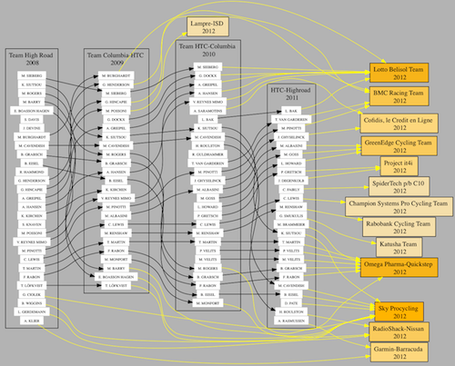
With the collapse of Bob Stapleton's HTC-Highroad, a slew of talent was released to the market - all of whom managed to find a new home. Over its four year history, Highroad supplied a lot of teams with quality riders, many of whom have gone on to be some of the top riders in the peloton.

Mouse over me


Who's the team with the most to owe to Highroad? That'd be Sky, who has 9 riders who spent time at some incarnation of Highroad. Omega Pharma-Quickstep and Lotto Belisol each have 7. BMC has 4, while GreenEdge and RadioShack-Nissan each clock in at 3. Garmin-Barracuda, Cofidis and Project it4i have 2, and Katusha, Lampre, Rabobank, Champion Systems and SpiderTech each have 1.

Monday, March 5, 2012

Weather and the Paris-Nice prologue


After reading that Bradley Wiggins raced conservatively in wet conditions at the prologue time trial of Paris-Nice on Sunday, I wondered whether the poor conditions led to average slower times in the time trial.

A scatter plot of start order on the horizontal axis to time behind the leader on the vertical axis shows that there's no discernible upward trend as the day carried on. The green line shows the overall trend. It stays horizontal rather than sloping upward - showing that the times were pretty much consistent throughout the afternoon, though the weather was changing. Why?

There are many reasons why. First, superior time trialists started toward the end of the order. If the weather slowed riders down, time trial specialists' faster times could have evened out the trend. Secondly, weather can have a lot of effects. Heavy rain slows a rider's speed, and wet roads forces a rider to corner conservatively. However, rain also reduces humidity in the air, lowering the air resistance. Wet roads also lead to less rolling resistance - meaning, faster rides. A rider might be fastest right after a rain shower.

A more thorough analysis would shed more light on the question, but based on a quick analysis I feel confident saying that though really foul weather might slow riders down, wet or simply poor weather might not have a significant effect on time trial performance.

Statisticians and others, feel free to chime in.

NB: I removed Nick Nuyens from the data since he crashed and finished over 6 minutes down in a ~12-minute time trial.